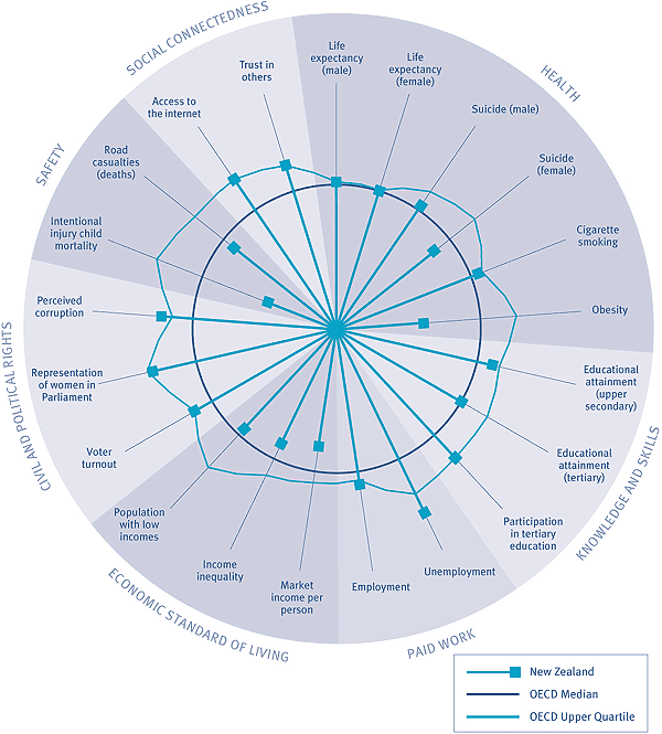
Latest Social Report 2016 | Previous reports | Contact us

International Comparisons:

Social wellbeing in New Zealand relative to the OECD

The following wheel compares New Zealand outcomes with those of the OECD.

Figure IC1 Social wellbeing in New Zealand relative to the OECD

Pie chart comparing social wellbeing in New Zealand with the OECD.

Interpreting "Social wellbeing in New Zealand relative to the OECD"

This figure shows wellbeing in New Zealand relative to the OECD against 21 outcomes. The circle Conclusion diagram circle. represents the OECD median for each outcome, and the spokes Conclusion diagram spoke. represent New Zealand's outcomes relative to the OECD median. The irregularly shaped line outside the OECD median circle OECD irregular line. represents outcomes of the OECD upper quartile relative to the OECD median. Where a spoke falls inside the circle, New Zealand is in the bottom half of the OECD. Where the spoke falls outside of the circle, outcomes in New Zealand are better than the OECD median. Where a spoke falls past the irregularly shaped line, New Zealand is in the top quarter of OECD outcomes. For each outcome, the most recent data has been used where possible. The majority of the data comes from between 2002 and 2005. However, poverty and income inequality data comes from 1999–2002 and mid-1990s data had to be used for intentional injury child mortality. SOME CAUTION IS REQUIRED WITH THIS DATA: International comparisons are difficult to interpret because of differences between countries in methods used to collect, classify and record social data.