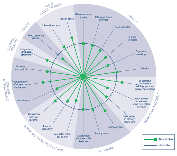
Social wellbeing in New Zealand relative to Australia
The following wheel compares New Zealand outcomes with those of Australia.
Figure IC2 Social wellbeing in New Zealand relative to Australia
Interpreting "Social wellbeing in New Zealand relative to Australia"
This figure shows wellbeing in New Zealand relative to Australia against 22 outcomes. The circle  represents the Australian outcome for each indicator, and the spokes represents the Australian outcome for each indicator, and the spokes  represent New Zealand’s outcomes relative to Australia’s. Where a spoke falls outside the circle, New Zealand’s outcome is better than Australia’s. Where the spoke falls inside the circle, outcomes in New Zealand are worse than Australia’s. For each outcome, the most recent data has been used where possible. The majority of the data comes from between 2004 and 2006. However, the population with low incomes data comes from 1999 (Australia) and 2001 (New Zealand) and Australia’s obesity data comes from 1999 (New Zealand’s is from 2003).
SOME CAUTION IS REQUIRED WITH THIS DATA: International comparisons are difficult to interpret because of differences between countries in methods used to collect, classify and record social data. represent New Zealand’s outcomes relative to Australia’s. Where a spoke falls outside the circle, New Zealand’s outcome is better than Australia’s. Where the spoke falls inside the circle, outcomes in New Zealand are worse than Australia’s. For each outcome, the most recent data has been used where possible. The majority of the data comes from between 2004 and 2006. However, the population with low incomes data comes from 1999 (Australia) and 2001 (New Zealand) and Australia’s obesity data comes from 1999 (New Zealand’s is from 2003).
SOME CAUTION IS REQUIRED WITH THIS DATA: International comparisons are difficult to interpret because of differences between countries in methods used to collect, classify and record social data.
|
