| Introduction | | People | | Health | | Knowledge & Skills | | Paid Work | | Economic Standard of Living | | Civil & Political Rights |
| Cultural Identity | | Leisure & Recreation | | Safety | | Social Connectedness | | Life Satisfaction | | Summary | | Notes & References |
DownloadEconomic Standard of |
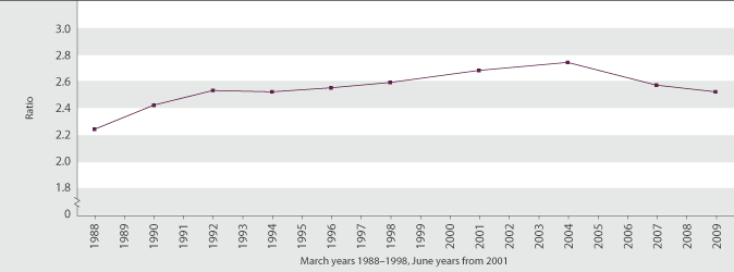
Income inequalityDefinitionThe extent of disparity between high income and low income households. The measure used is the ratio of the 80th percentile to the 20th percentile of the equivalised disposable household income distribution (ie the ratio of a high household income to a low household income, after adjusting for household size and composition). The higher this ratio, the greater the level of inequality. RelevanceThe degree of income inequality is often regarded as an important aspect of the fairness of the society we live in. A high level of income inequality may also be detrimental to the level of social connectedness across society. Current level and trendsIn 2009, the equivalised disposable income of a household at the 80th percentile was 2.5 times larger than that of a household at the 20th percentile. This was about the same as the ratio in 2007. In 1988, the ratio was 2.2. Income inequality rose steeply between 1988 and 1991, briefly plateaued, then rose steadily from 1994 to 2004. Most of the observed increase in income inequality between 1988 and 2004 was due to a larger overall rise in incomes for those in the top 20 percent of incomes – around a quarter once adjustments for inflation are made. In that period, incomes for those in the bottom 20 percent of incomes decreased a little. Incomes for the middle 60 percent climbed more overall for those closer to the top 20 percent than for those closer to the bottom 20 percent. From 2004 to 2009, incomes for households in the low to middle income range rose more quickly than incomes for higher income households. Incomes for households in the lower four deciles grew by 18–25 percent, while incomes for those households above the median typically grew by around 10–12 percent. This was the only period in the last 25 years in which the incomes of low to middle income households grew more quickly than the incomes of those households above the median.65 Figure EC2.1 Ratio of the 80th percentile of equivalised disposable household income to the 20th percentile of equivalised disposable household income, 1988–2009
Source: Derived from Statistics New Zealand’s Household Economic Survey (1988–2009), by the Ministry of Social Development International comparisonComparisons with other OECD countries are available using a different measure, the Gini coefficient.66 Gini coefficients measure income inequality, with a score of 100 indicating perfect inequality and a score of 0 indicating perfect equality. The most recent OECD comparison (from 2004) gives New Zealand a score of 34, indicating higher inequality than the OECD median of 31 and a ranking of 23rd equal out of 30 countries. New Zealand’s Gini score was below that of the United States (38), very close to those of the United Kingdom (34) and Ireland (33), a little above those of Canada and Japan (32), and a little further above that of Australia (30). Denmark and Sweden had the lowest income inequality with Gini scores of 23.67 In 2007 and 2009, the Gini score for New Zealand was slightly lower, at 33. » View technical details about the income inequality indicator |