Conclusion
This section summarises how social wellbeing is changing over time in New Zealand and how social wellbeing is distributed across different population subgroups. For the first time, we also draw some tentative conclusions about how social wellbeing varies across different parts of the country.
Changes in social wellbeing over time
We have new data for 25 of the 42 indicators used in this year's edition of the report. The pattern of change shown in the report is broadly consistent with the picture revealed by The Social Report 2004 . The key addition to the 2005 report is new data showing what has happened to indicators of economic living standards since 2001. This shows an overall decline in the proportion of the population on low incomes, an overall decline in the proportion of households spending more than 30 percent of their income on housing costs, and a slight increase in overall income inequality.
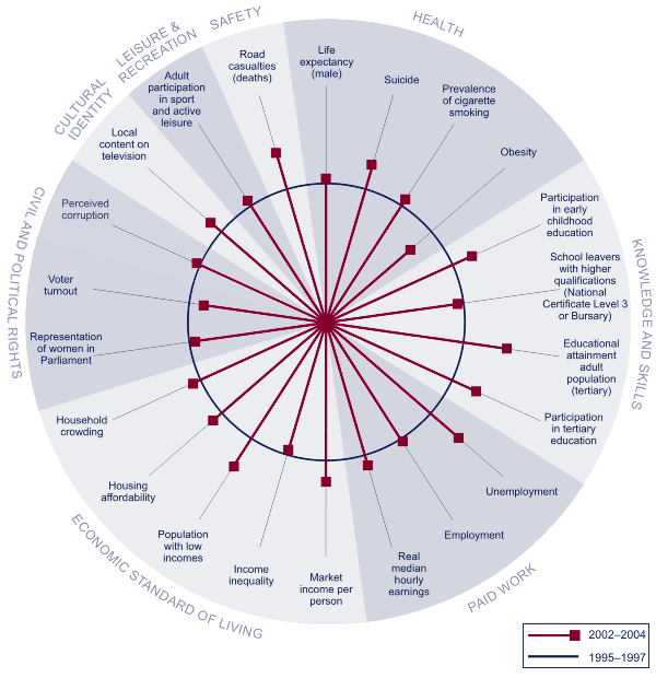
Figure CO1 compares the most recent figures with those of the mid-1990s to show how wellbeing has changed over the past decade. Sixteen of the 22 indicators for which we have comparable data have shown some improvement, three have deteriorated slightly, and three show no significant change.
Figure CO1 Changes in social wellbeing, 1995–1997 to 2002–2004

Interpreting "Changes in social wellbeing, 1995–1997 to 2002–2004"
The circle represents average performance against each indicator between 1995 and 1997, and the spokes represent the most recent performance, where possible averaged over the most recent three years. Where a spoke falls outside of the circle, this means outcomes have improved since the mid-1990s; the further from the circle it falls, the more significant the improvement. Where a spoke falls within the circle, outcomes in this area have deteriorated since the mid-1990s; the further the spoke is from the circle, the more pronounced the deterioration. There are, however, some important limitations on this style of presentation. In particular, we cannot directly compare the size of changes for different indicators. The absence of trend data for some indicators also means we can only show 22 of the 42 indicators used in The Social Report 2005.
Time-series data going back to the mid-1980s is also available for a smaller number of indicators. This data, in combination with the data used in Figure CO1, shows three main patterns of change over the past two decades.
As shown in previous editions of the social report, indicators of life expectancy, cigarette smoking, participation in early childhood and tertiary education, the educational attainment of the adult population and road casualties have improved on a fairly consistent basis since the mid-1980s.
The representation of women in Parliament steadily increased between the mid-1980s and 1999, though it declined marginally in the 2002 election. New Zealand has consistently demonstrated very low levels of perceived corruption since surveys began in 1997.
Market income per person, unemployment, employment, housing affordability, the proportion of the population on low incomes, income inequality and suicide all deteriorated between the late-1980s and early-1990s.
Market income per person has been steadily increasing since the mid-1990s. Employment, unemployment and low incomes began to recover in the mid-1990s, plateaued or deteriorated slightly towards the end of the 1990s, and have been improving steadily since then. Housing affordability began to improve towards the end of the 1990s.
Market income per person, unemployment and employment have all now returned to, or are better than, levels recorded in the mid-1980s. However, neither the proportion of the population on low incomes nor housing affordability has returned to the levels of the mid-1980s.
The proportion of people living in crowded housing has also decreased since the early-1990s but we do not have trend data to show how this compares with the mid-1980s. Real median hourly earnings have increased since 1997 when the New Zealand Income Survey began.
Suicide rates began to improve towards the end of the 1990s and are now lower than they were in the mid-1980s.
Voter turnout, obesity and income inequality have all worsened since the mid-1980s. The growth in income inequality since the mid-1990s has occurred despite a decline in the proportion of the population on low incomes over that same period. This suggests that, while incomes at the lower end of the income distribution have grown, growth at the middle and upper ends of the distribution has been stronger.
Child maltreatment deaths almost doubled between the mid to late-1980s and there has been very little change since then.
There was little change in the proportion of school leavers with higher qualifications from the early 1990s through to 2002. 2003 data shows an increase against this indicator.
|

