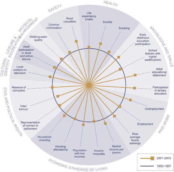
The diagram below compares wellbeing today with our performance in 1995-1997, using those indicators for which we have trend data.
Figure CO1 Changes in social wellbeing,
1995-1997 to 2001-2003

| Interpereting 'Changes in social wellbeing 1995/97 to 2001/03' |
|---|
| The outer circle represents average performance against each indicator between 1995 and 1997, and the spokes represent the most recent performance, where possible averaged over the most recent three years. Where a spoke falls outside of the circle, this means that outcomes have improved since the mid-1990s; the further from the circle it falls, the more significant the improvement. Where a spoke falls within the circle, outcomes in this area have deteriorated since the mid-1990s; the further the spoke is from the outer circle, the more pronounced the deterioration. There are, however, some important limitations on this style of presentation. In particular, we cannot directly compare the size of changes for different indicators. The absence of trend data for some indicators also means that we can only show 23 of the 43 indicators used in The Social Report 2004. |
Of the 23 indicators for which a time series is available, 16 have shown some improvement since the mid 1990s. There has been no change in five of the indicators. Two of the indicators - the proportion of young people leaving school with higher qualifications, and voter turnout - have deteriorated slightly since the mid-1990s.
The indicators enable overall conclusions about only some social report domains.
Indicators of life expectancy, suicide, and cigarette smoking point to improvements in the health of the population since the mid-1990s.
In the knowledge and skills area there is a generally positive picture. There has been significant growth in participation in early childhood and tertiary education, and improvements in the educational attainment of the adult population. However there has been a slight decline in the proportion of young people who leave school with higher qualifications.
The overall prosperity of the nation, average hourly earnings, and unemployment have all improved since the mid-1990s, but there has been little change in income inequality and housing affordability. The last two indicators are however based on data from 2001, and conditions may have changed since then.
In the area of civil and political rights there is a mixed picture. While there has been no change as measured by indicators of absence of corruption and the proportion of women in parliament, there has been a decline in voter turnout.
Many of the indicators for which there is long-term trend available also show that wellbeing is as good as, or better now, than during the mid-1980s. New Zealanders are on average living longer lives, are better educated, and are more likely to be employed. There are some important exceptions, however, with housing affordability, poverty, income inequality, and voter turnout having deteriorated.
Most of these indicators have steadily improved over the last two decades. The exceptions are those directly linked to economic conditions. Poverty, unemployment, and suicide worsened during the 1990s but have subsequently improved, though not to mid-1980s levels in the case of poverty.
