Economic standard of living
Income inequality
Definition
The extent of disparity between high-income and low-income households.
RelevanceTop
The degree of income inequality is often regarded as an important aspect of the fairness of the society people live in. A high level of income inequality may also be detrimental to the level of social connectedness across society. The measure used is the ratio of the 80th percentile to the 20th percentile of the equivalised disposable household income distribution (ie the ratio of a high household income to a low household income, after adjusting for household size and composition). The higher this ratio, the greater the level of inequality.
Current level and trendsTop
In 2014, the equivalised disposable income (before housing costs (BHC)) of a household at the 80th percentile was 2.8 times larger than that of a household at the 20th percentile. This was a little higher than the earlier high point in 2004 (2.7), and above the general trend level from 2007 to 2013 (2.6). Whether the 2014 figure is a statistical blip or a new steady higher level will not be clear until survey results are available for 2015 and 2016.
Figure EC2.1 – Ratio of the 80th percentile of equivalised disposable household income
(before housing costs) to the 20th percentile of equivalised disposable household
income, 1982–2014
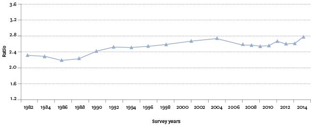
Source: Perry (2015a), Ministry of Social Development, using data from Statistics New Zealand's Household Economic Survey
Note: The period between Household Economic Surveys has varied across the period shown.
Over the period of the survey, the ratio was the highest in 2014 (2.8) and lowest in 1986 (2.2). The only period of sustained declines in the ratio following significant increases from 1986 was between 2004 (2.7) and 2009 (2.6), the period preceding the impact of the Global Financial Crisis and associated economic downturn.
Table EC2.1 – The 80th percentile real equivalised disposable household income
(before housing costs) and 20th percentile real equivalised disposable household
income and P80/P20 ratio, 1986–2014
| 1986 | 1990 | 1994 | 1998 | 2001 | 2004 | 2007 | 2009 | 2010 | 2011 | 2012 | 2013 | 2014 | |
|---|---|---|---|---|---|---|---|---|---|---|---|---|---|
| P80 – $ (1,000) | 39.2 | 42.8 | 38.6 | 44.1 | 45.5 | 48.0 | 50.2 | 53.4 | 52.7 | 53.8 | 55.1 | 55.8 | 59.1 |
| P20 – $ (1,000) | 17.8 | 17.6 | 15.4 | 17.0 | 17.0 | 17.5 | 19.5 | 20.9 | 20.6 | 20.1 | 21.1 | 21.2 | 21.3 |
| P80/P20 | 2.2 | 2.4 | 2.5 | 2.6 | 2.7 | 2.7 | 2.6 | 2.6 | 2.6 | 2.7 | 2.6 | 2.6 | 2.8 |
Source: Perry (2015a), Ministry of Social Development, using data from Statistics New Zealand's Household Economic Survey
Notes: The period between Household Economic Surveys has varied across the period shown. Results are in 2014 dollars.
For the survey period as a whole, incomes for households in the 80th percentile had increased more than for households in the 20th percentile, and there was also a greater spread of incomes in 2014 relative to the early 1980s. Between 1986 and 2014, incomes for the 20th percentile increased by 19 percent, compared with 47 percent for the 80th percentile. Most of this occurred between 1986 and 1998.
International comparisonTop
From the late 1980s through to the mid-1990s, income inequality in New Zealand increased significantly. When the volatility in the most recent income inequality figures is smoothed, there is not yet any conclusive evidence of a rise in income inequality using the Gini since the mid-1990s. As with the 80:20 ratio above, the current trend will not be clear until survey results are available for 2015 and 2016.
Figure EC2.2 – Inequality in New Zealand and the OECD using the Gini coefficient,
1982–2014
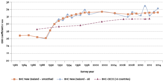
Source: Perry (2015a), Ministry of Social Development, using data from Statistics New Zealand's Household Economic Survey, OECD
Notes: The period between Household Economic Surveys has varied across the period shown as has available OECD data. BHC is before housing cost. The result for the OECD captures 16 countries consistently reported over time.
Data for this section can be found at: www.socialreport.msd.govt.nz/documents/2016/ec2.xlsx
